TORUS DATA FONT - PROCESS
A few years ago, I set a goal to explore fictional UI and learn some basic 3D skills. I took an online class on UI and Data Design for Film (like sci-fi HUDs and alien interfacess), and I really enjoyed learning some new ways to create art. This personal project culminated in some style sheets that reflect both 2D design and 3D renders (planes of 2D UI composited with abstract modeling and lighting). Thinking about UI as a fictional world-building device ended up being super helpful when I joined the Call of Duty team.
REFERENCE COLLECTION: Futuristic, Data-heavy Images
I researched some concepts and visuals that could inform an abstract interface.
MIND MAP: Brainstorming
I learned about mind maps (and the nifty app called MindNode) and how they can visualize and organize rough ideas.
SKETCHES: Composition and UI Assets
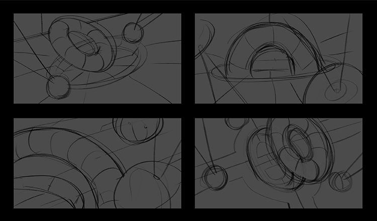
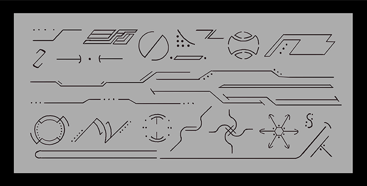
After settling on the idea of some sort of futuristic torus shape on a table, I sketched out some comps. I also drew some linear design elements to start thinking about a "UI Asset Army." These pieces would be repeated, combined, modified, etc. to create an alien-looking interface.
3D TORUS: Experimentation and Render Tests
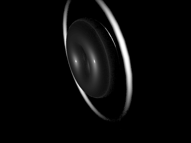
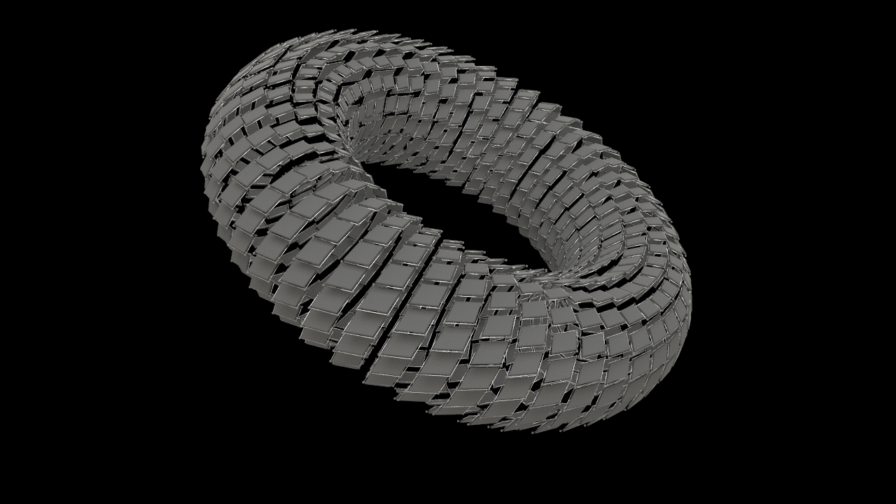
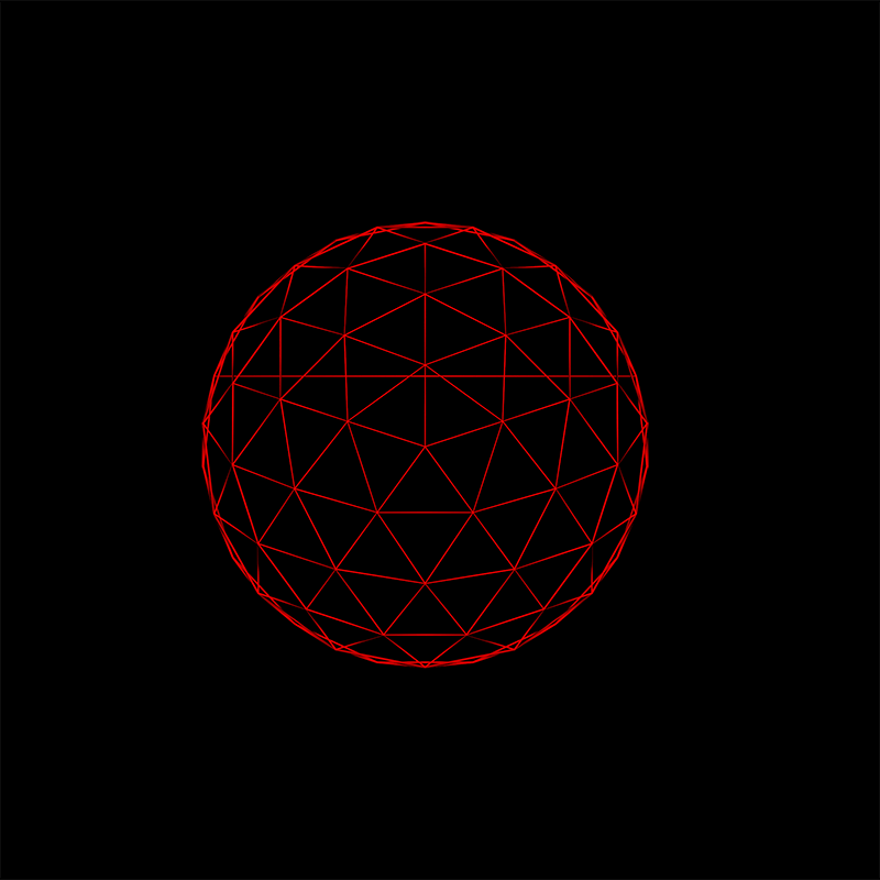
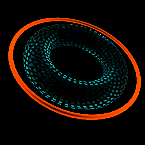
I decided to try and learn some basic Houdini skills, both to get some light 3D experience and expose myself to a highly technical tool. It was a challenging learning experience, for sure, but the node-based system is pretty cool! Here are some early torus renders I made with different modifications and effects.
3D STAGE: Experimentation and Render Tests
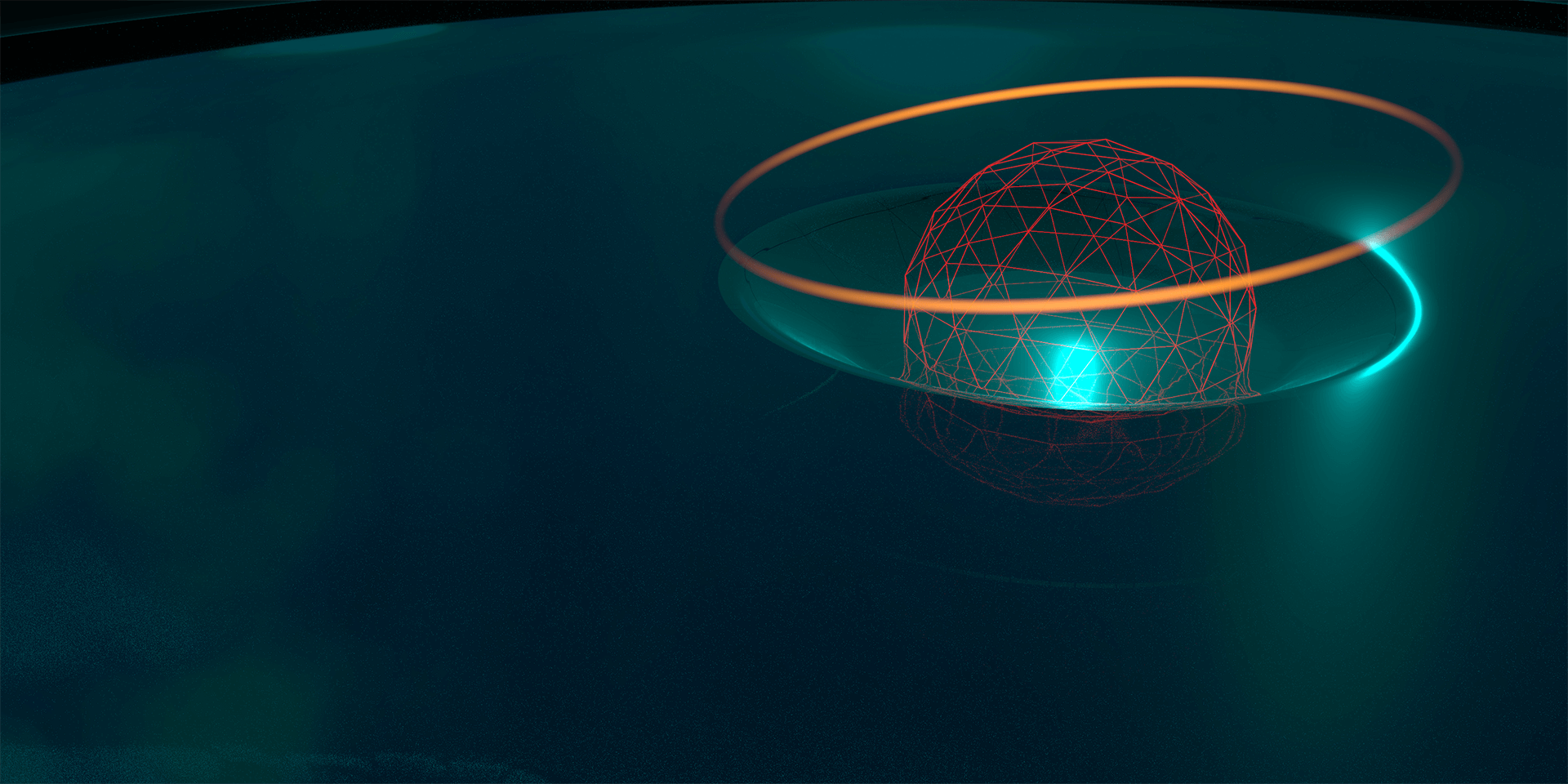
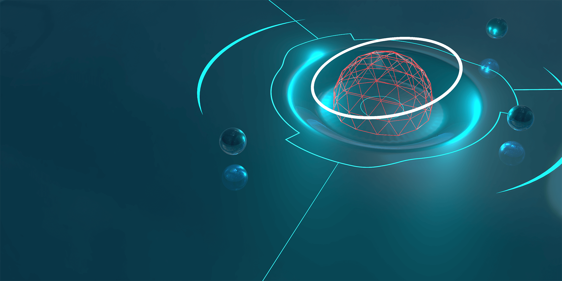
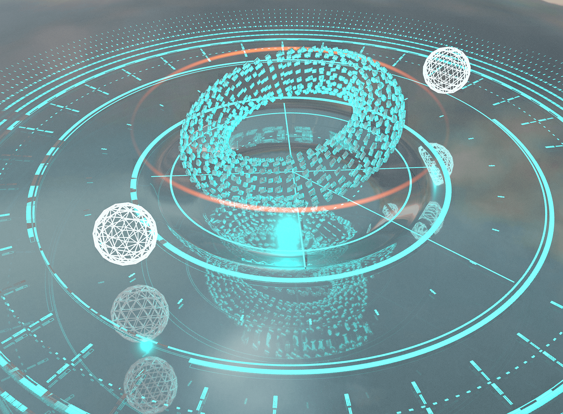
I placed the torus objects on a surface with a depression and thought it was starting to look interesting. I made some futuristic design elements in Illustrator and imported them into the scene as texture planes.
HOUDINI: Scratching the Surface
Here's a screenshot of the WIP scene in Houdini with the torus, table, and a couple of lights.
UI ASSETS: Abstract Design
I switched over to Illustrator to focus on generating a lot of abstract design elements. I liked the idea of leaning into radial patterns and rounded corners.
2D ITERATION: Design Parameters
I wasn't happy with the blue, monochromatic render tests above. So I brought some of the Illustrator assets into Photoshop to approach the problem from that angle and work out the fundamentals: shape, color, composition, etc. I also gave myself some parameters by trying to stick to radial design patterns, bright complementary colors, and flat design elements with soft gradients.
2D ITERATION: Building More
This new direction was exciting, so I kept building on it!
FINAL STYLE FRAME: Composited Image
I imported the UI assets back into Houdini as a large texture plane with transparency. Then I changed the color of the lights and properties of the table surface to work with the brighter UI colors. I kept experimenting with ways to alter a torus in Houdini and found a solution that had a nice sense of implied motion. The table (and UI textures) and torus objects were rendered separately and composited in Photoshop. I added some additional effects in Photoshop: portions of the UI are raised to break up the flatness, depth of field, subtle reflections, noise/grain, and general color and value adjustments. I had a great time working on this and learned a lot!


