FAR BEAM TRAVEL - PROCESS
My goals for this side project were to:
- showcase some of the creative process I've practiced and built up over the years
- create a cyberpunk/sci-fi world that's cheerful and full of color
- explore an action-adventure, light RPG game UI/UX
REFERENCE COLLECTION
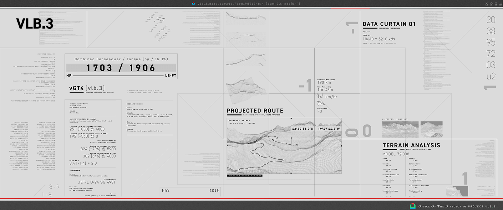
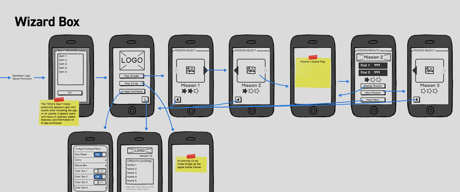
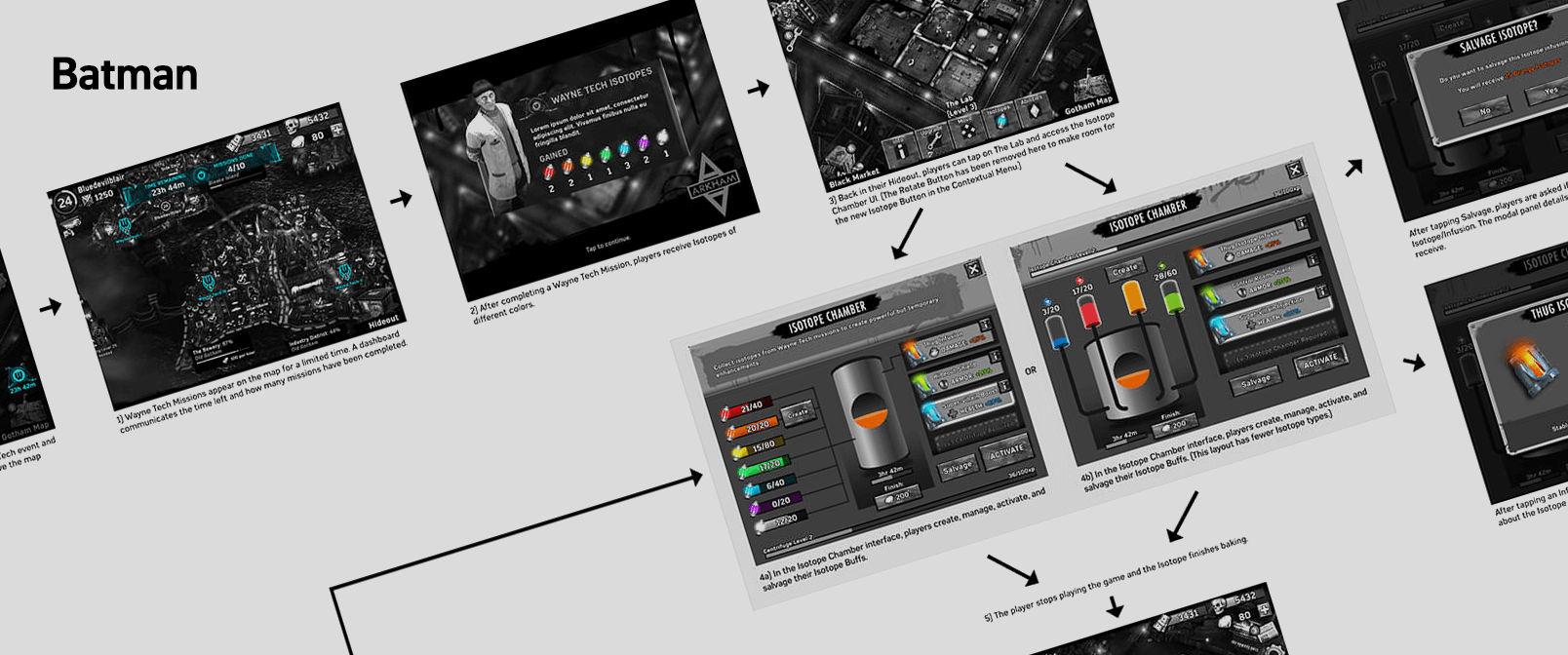
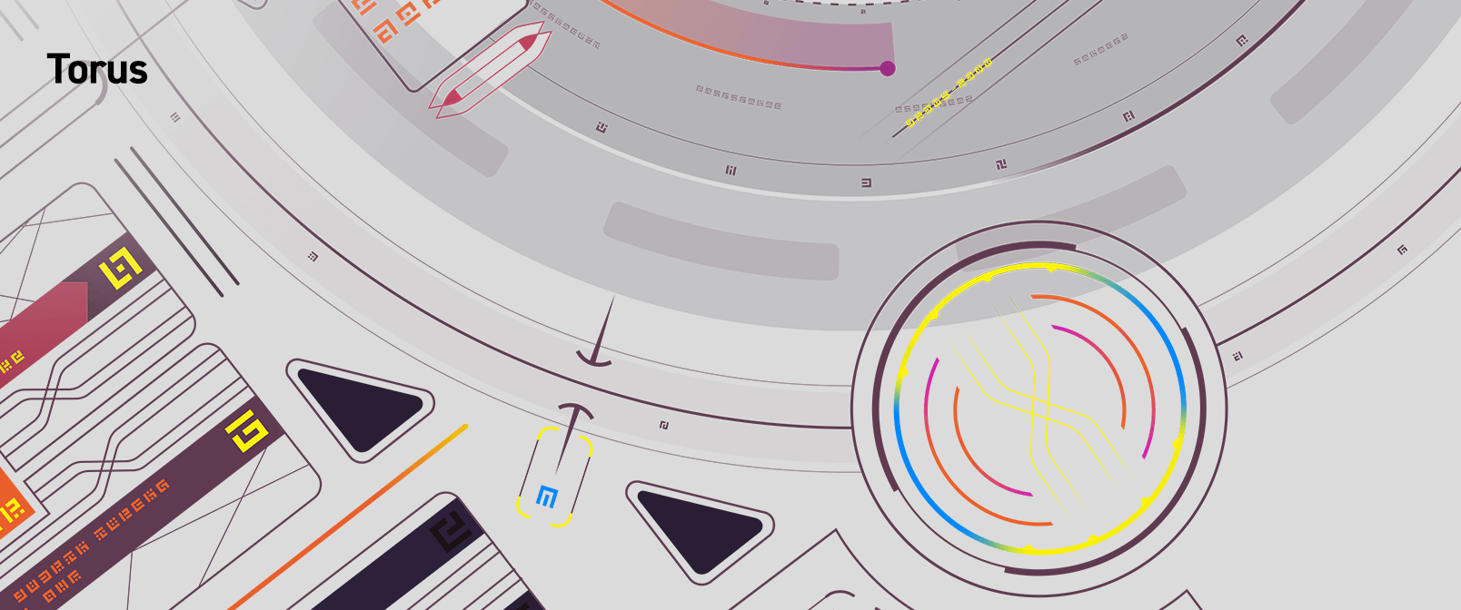
I always like to do a lot of visual research when starting something new. I cast a pretty wide net for this project, looking at games (console and mobile, as well as different genres), movies, web design, statues, fictional interfaces, and other areas of art and design.
REFERENCE SHEETS: Game Menus
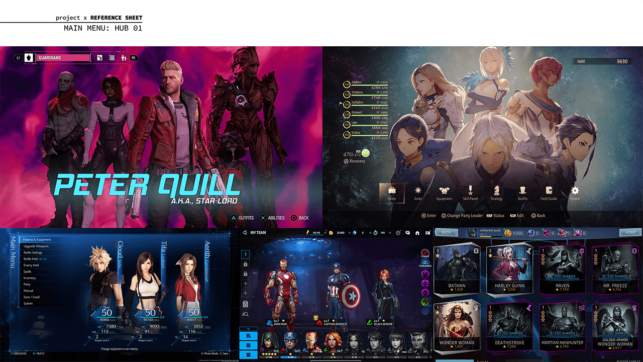
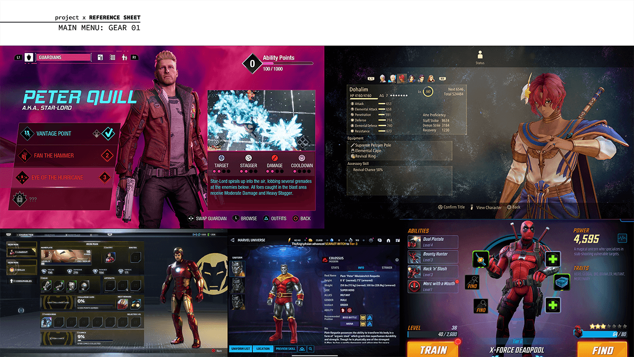
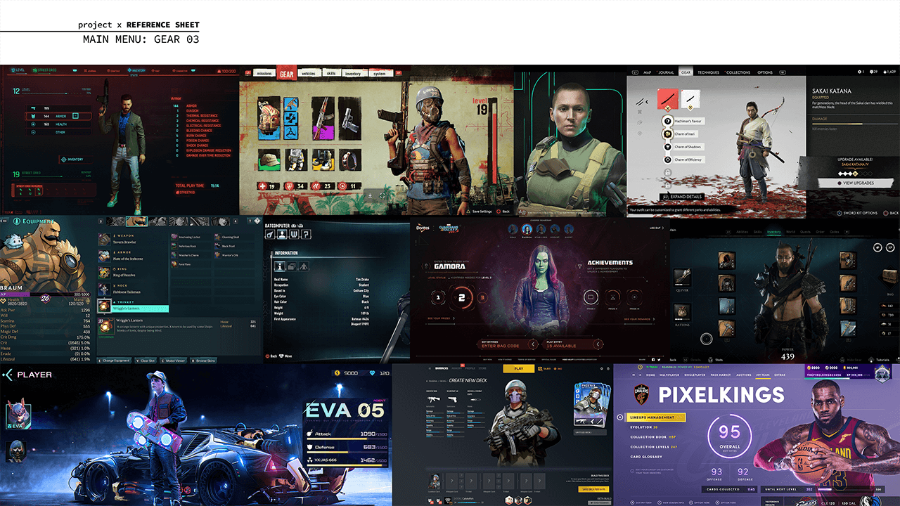
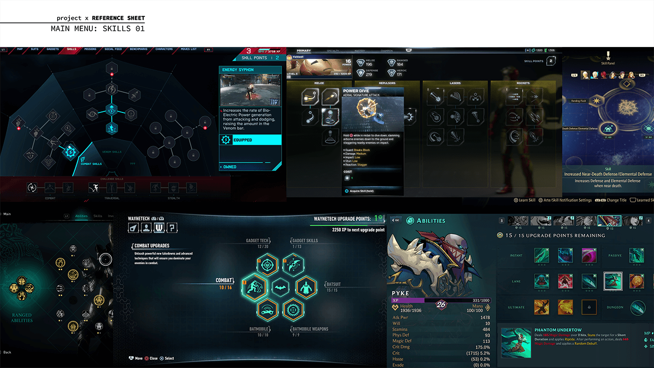
I collected screenshots from console and mobile games that feature teams of characters—these sheets focus on menu hubs and character management. This reference is informative in terms of visual design, user experience design, and overall competitive analysis.
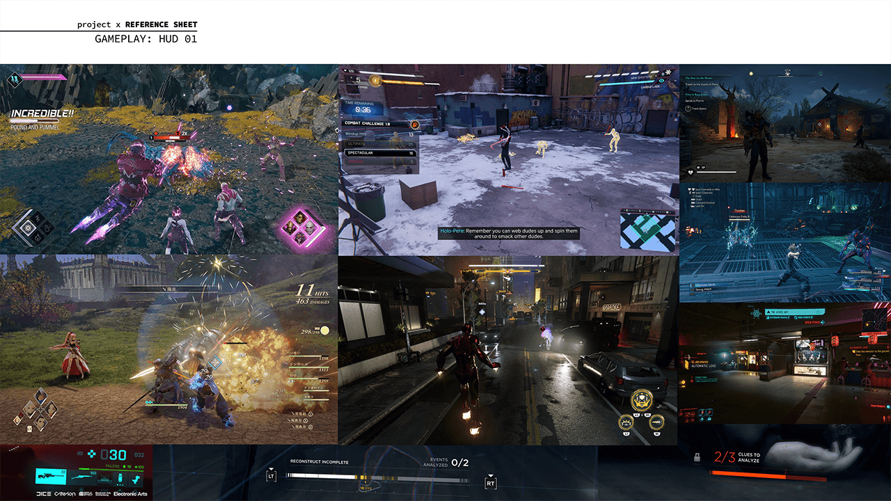
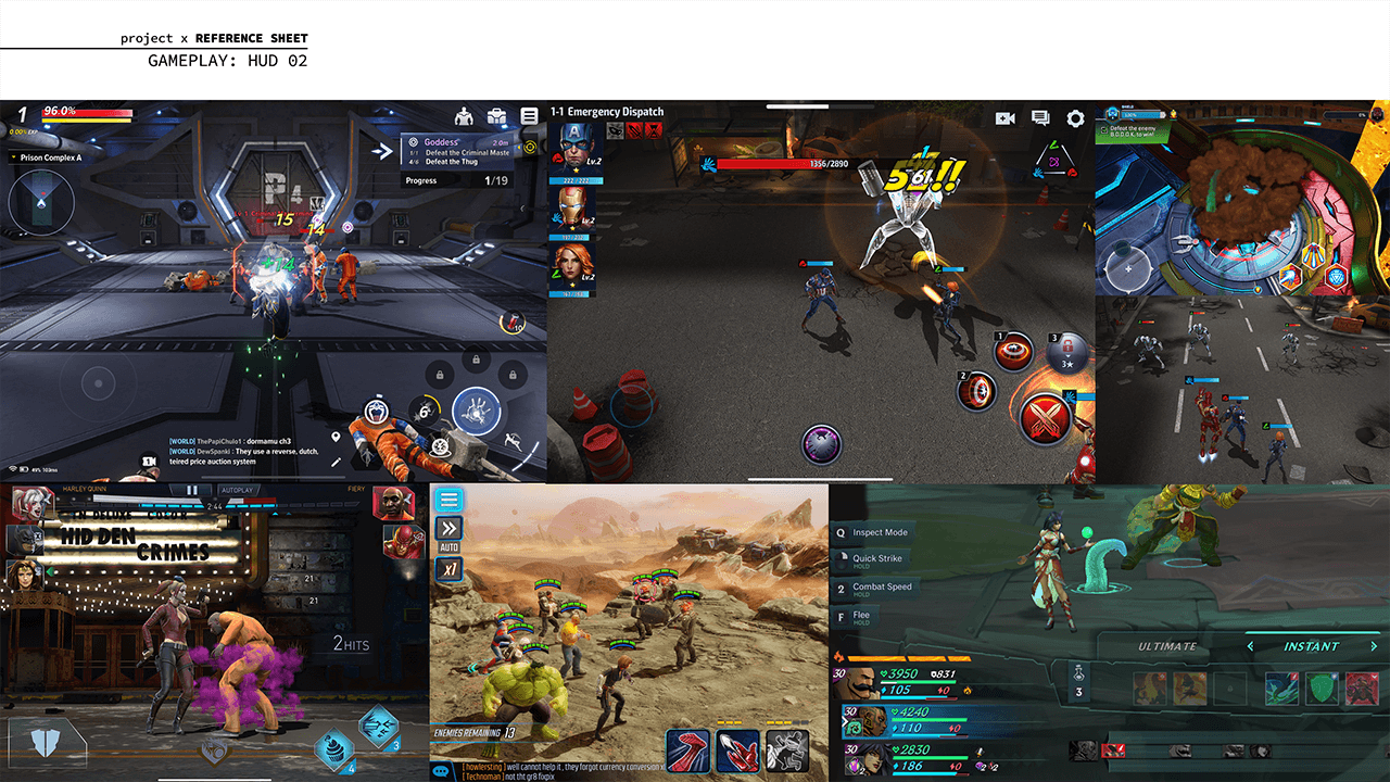
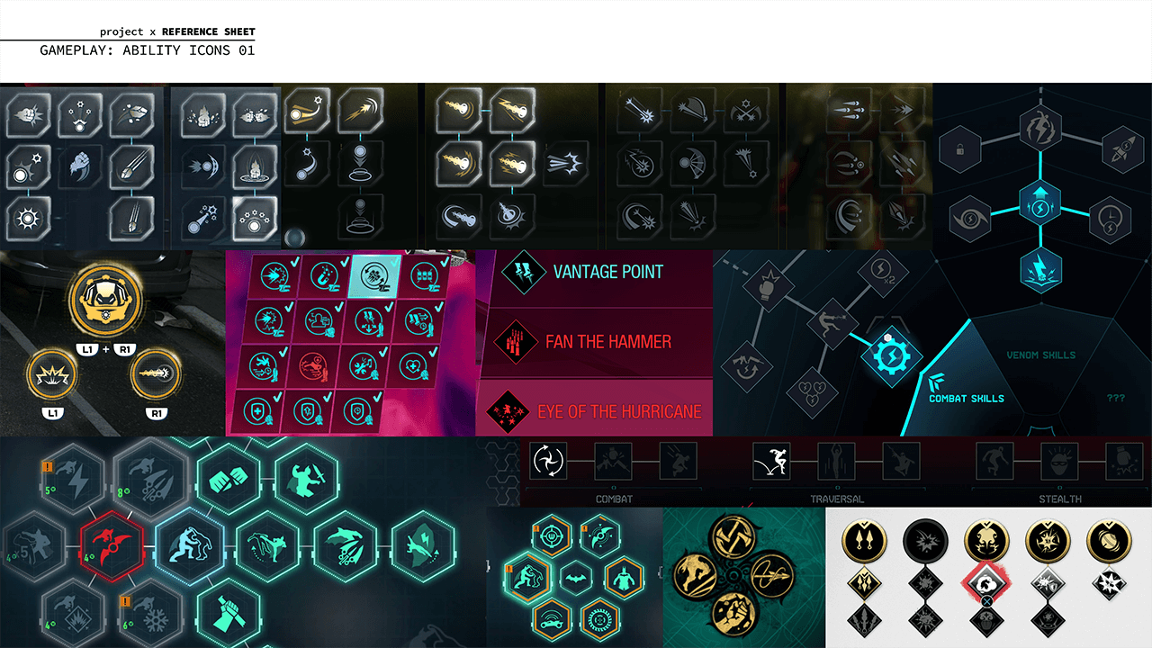
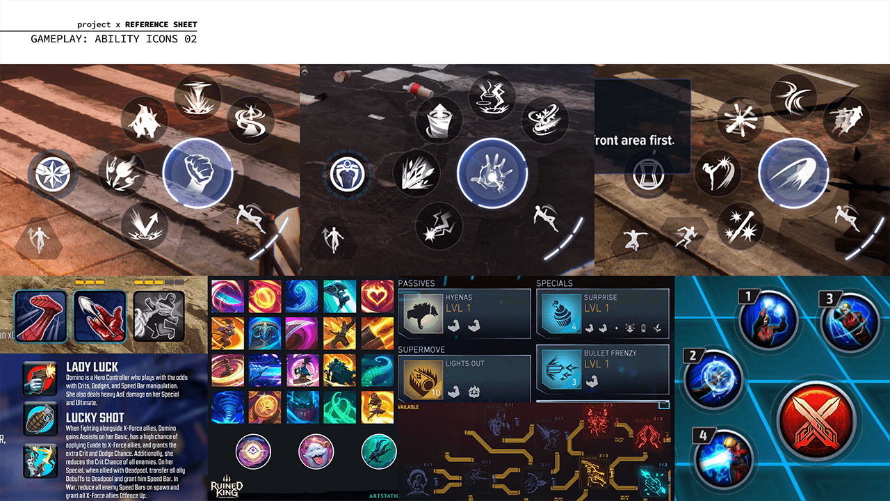
REFERENCE SHEETS: HUDs and Ability Icons
These reference sheets capture gameplay UI, HUDs, and ability icons in various games.
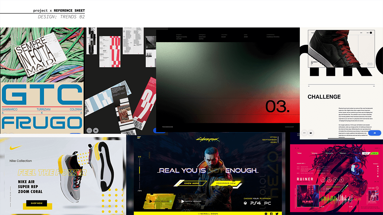
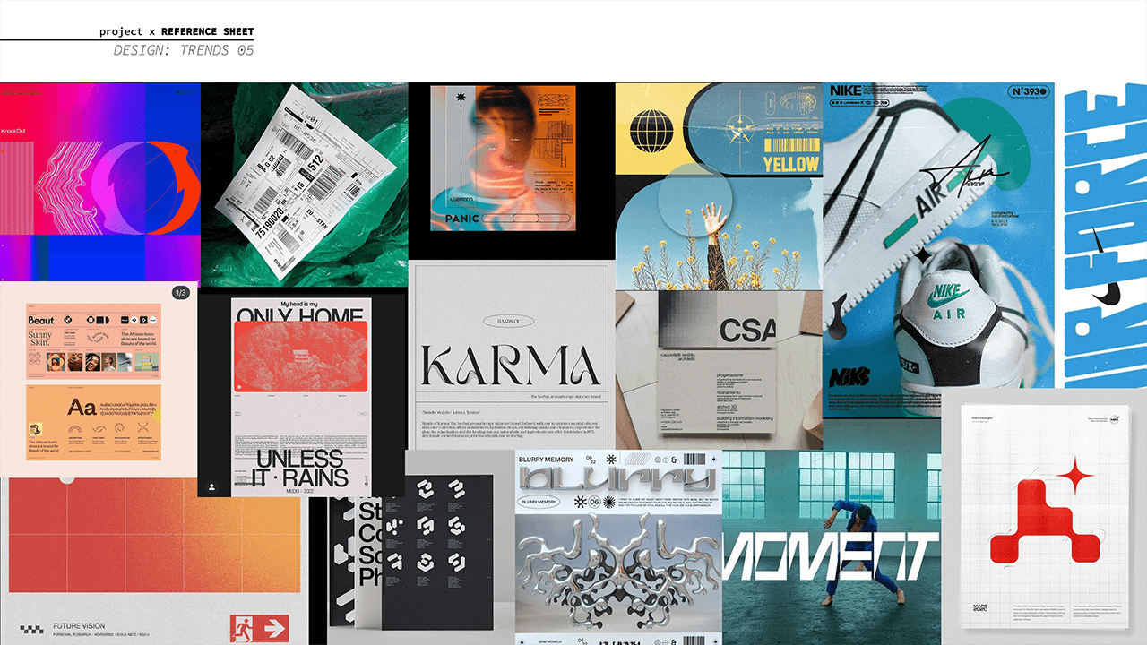
REFERENCE SHEETS: Visual Design Styles
I also looked at current design trends for inspiration.
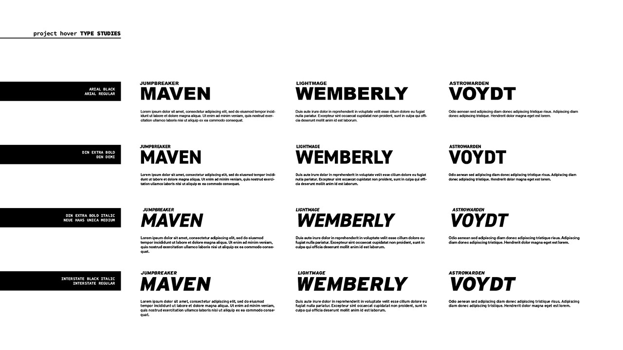
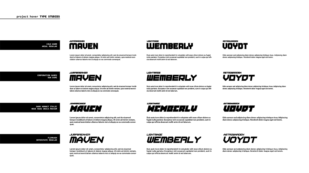
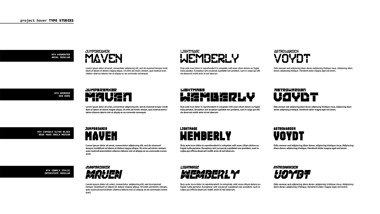
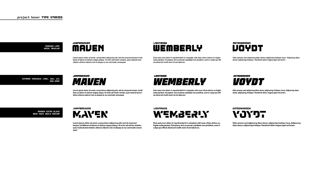
TYPE STUDIES
Sometimes a new project can feel overwhelming, so I find that type studies can help me jumpstart my creative process. I ended up going with a stylish display typeface called Cutmark. It has strong angles and chamfers, yet doesn't feel blocky in a generic sci-fi way. As a variable font, there's plenty of weight options for readability, and the type looks great italicized.
UX ITERATION: Equipment
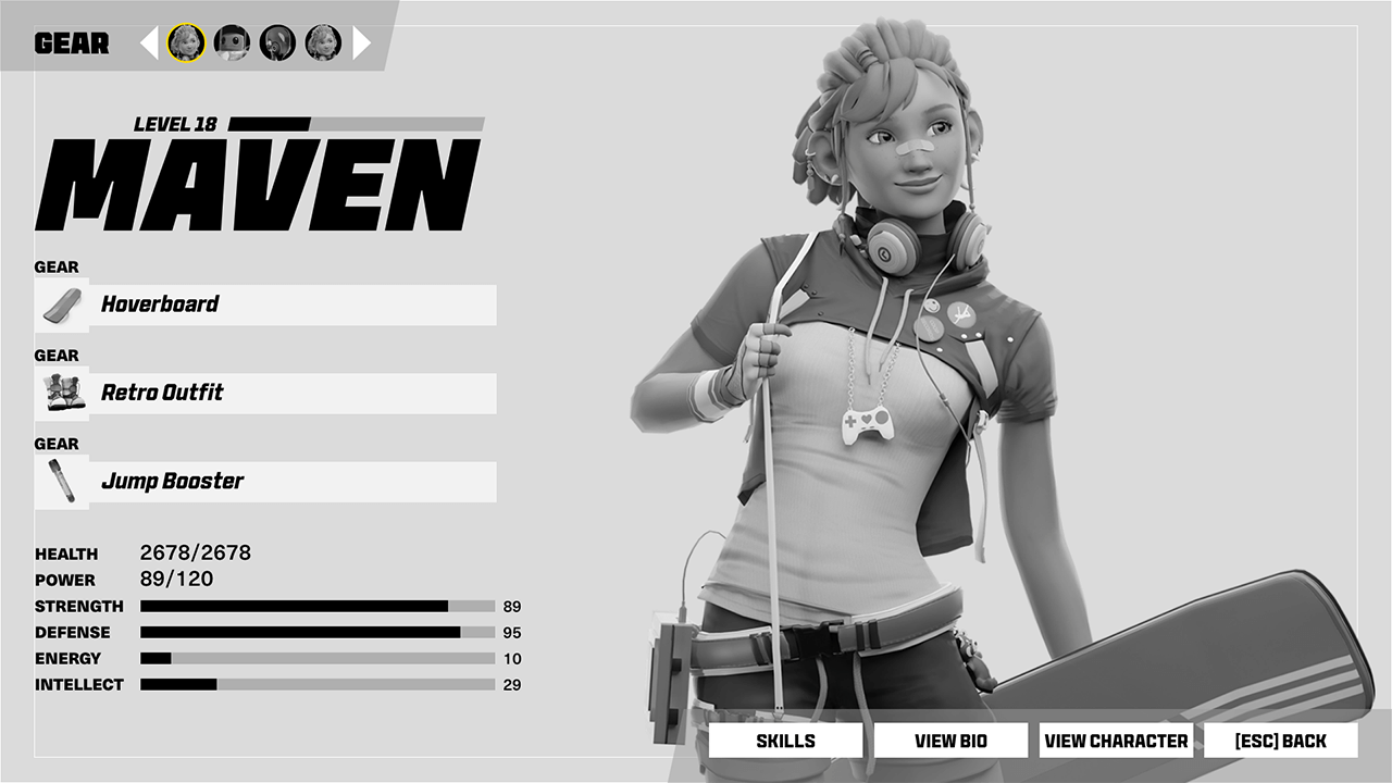
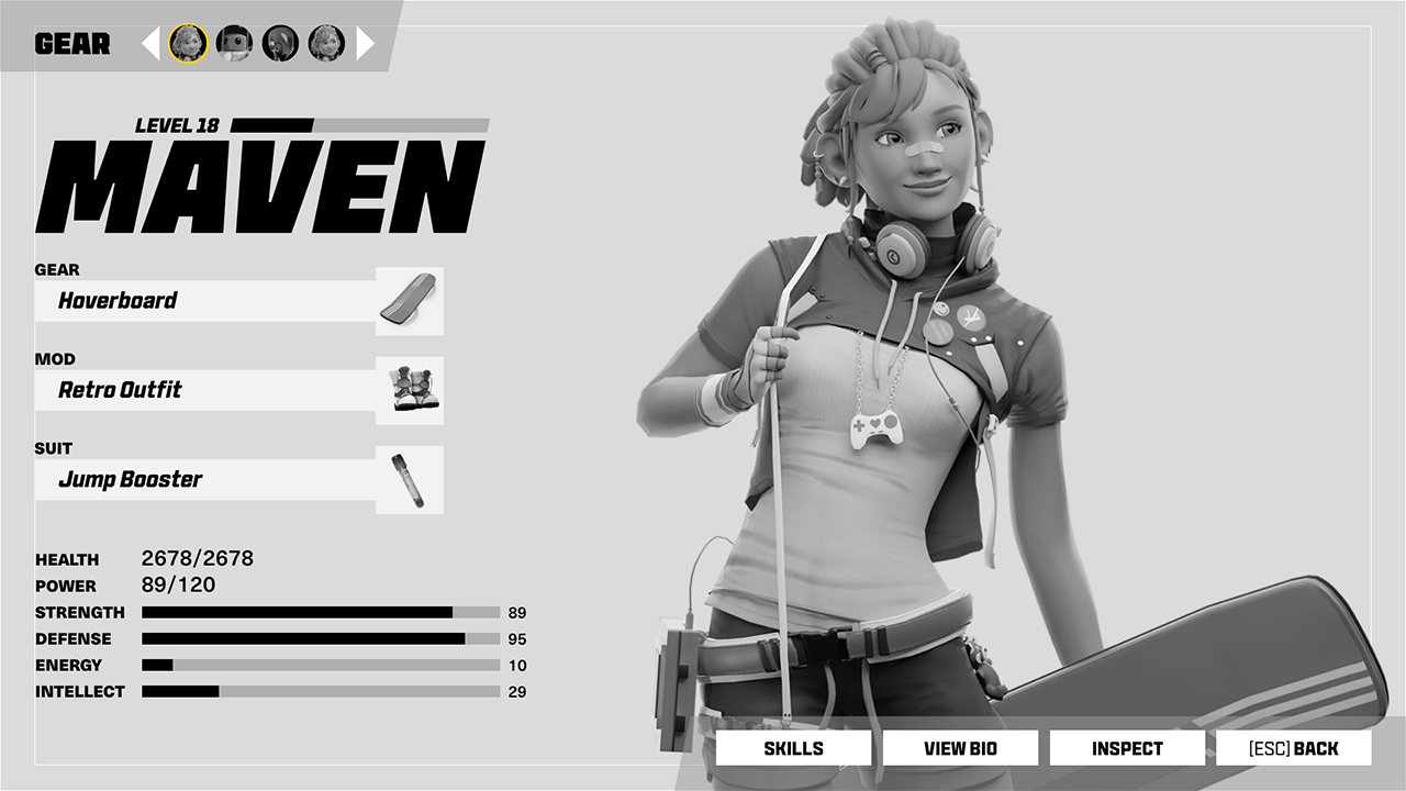
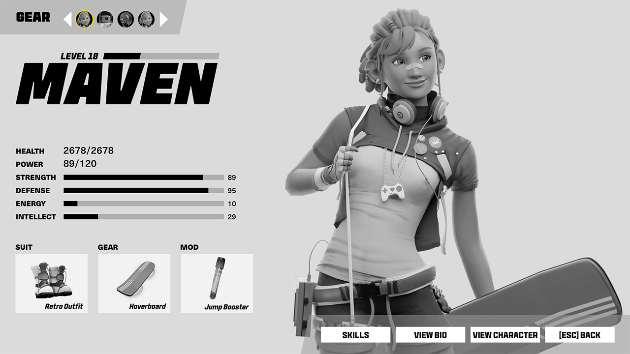
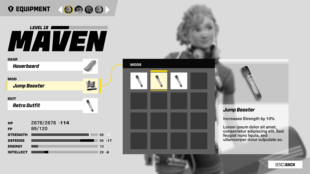
The first screen I started experimenting with was the Equipment UI. I chose this menu because it has a large character render, display type, a button list, stats, and various icons. It captures a lot of different types of UI elements that need to harmonize.
UX ITERATION: Main Hub
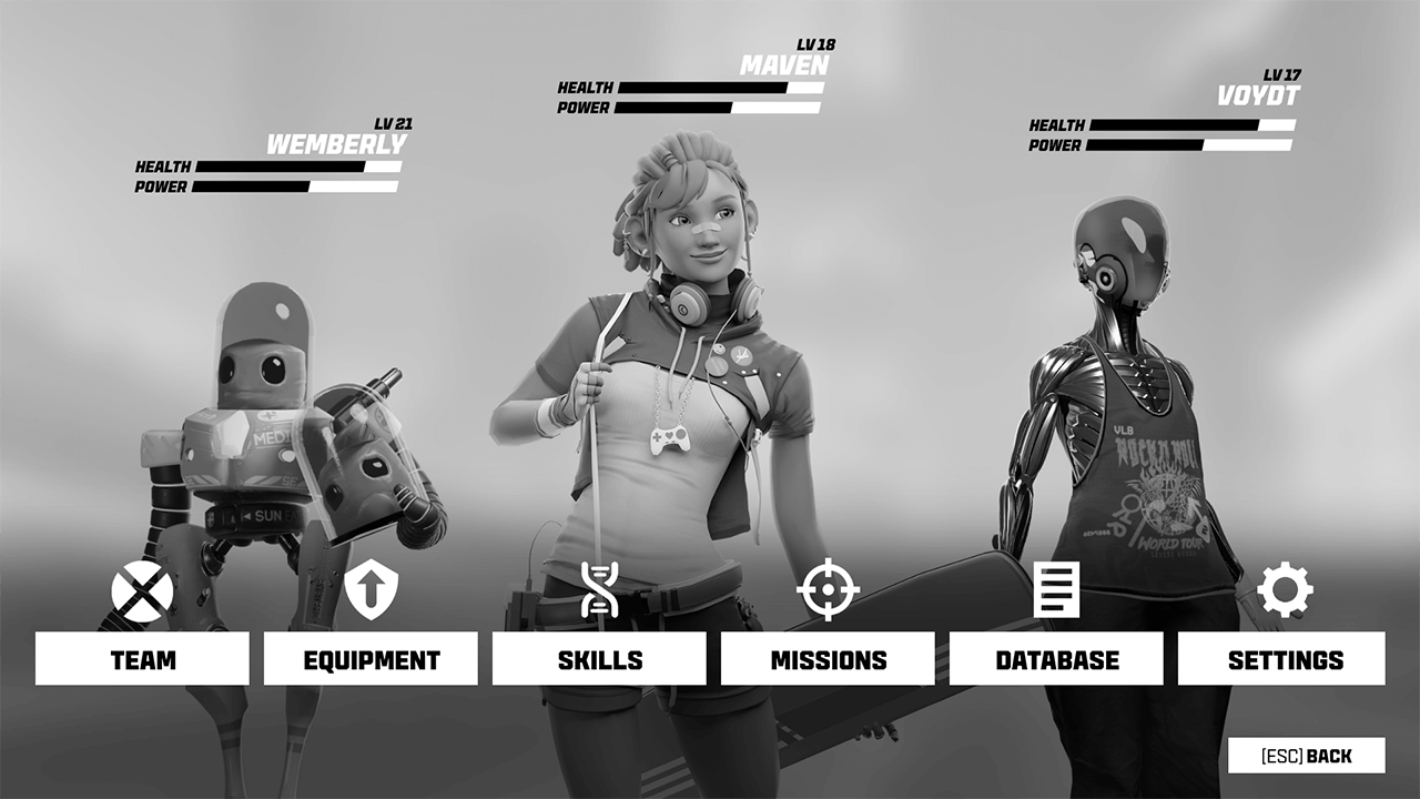
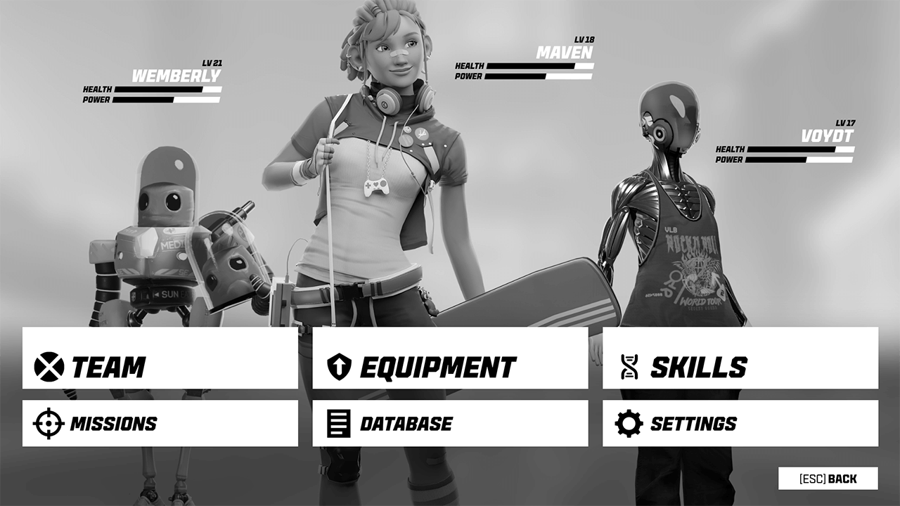
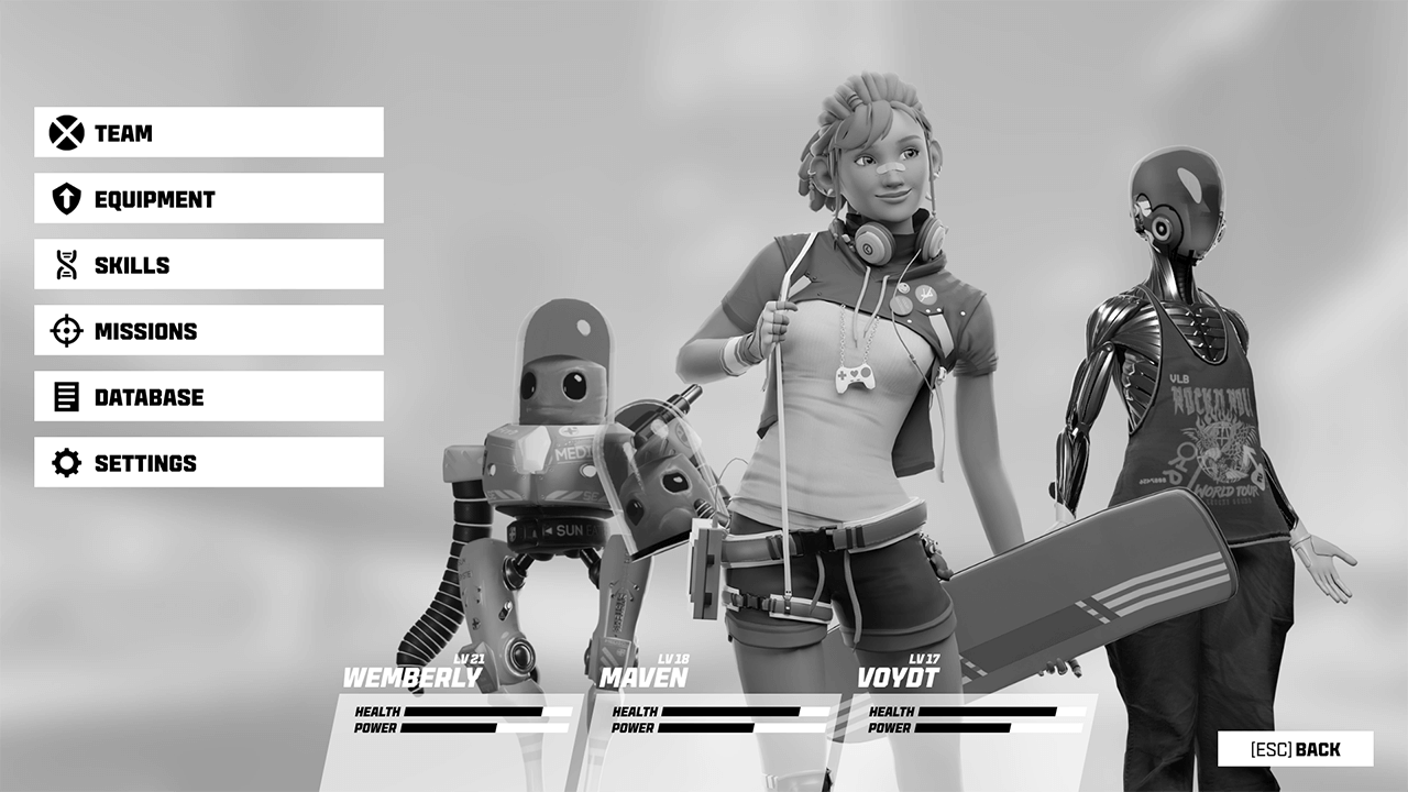
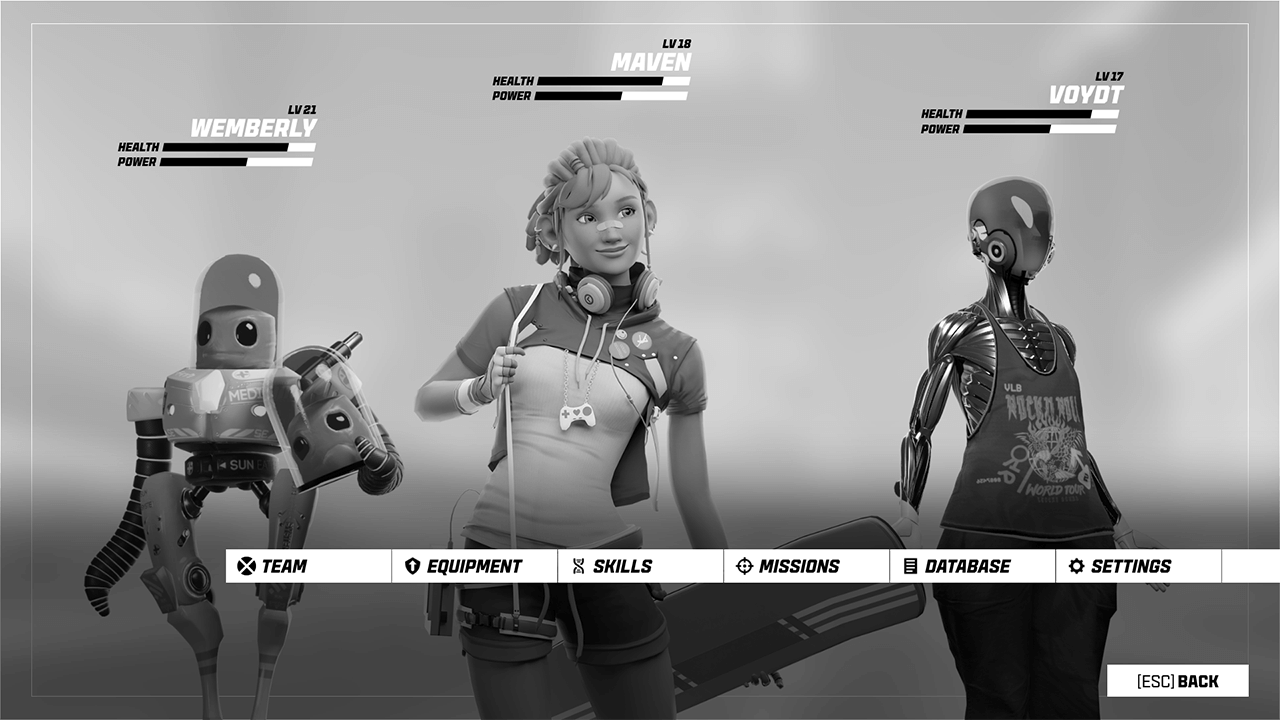
This main hub, which appears when players press the touchpad, is the center of the hub-and-spoke menu system. Players can see their team members' stats and dive into specific sub-menus to do things like edit their team, manage character equipment, upgrade skills, etc. I gave the characters a lot of screen real estate here to make them feel larger than life.
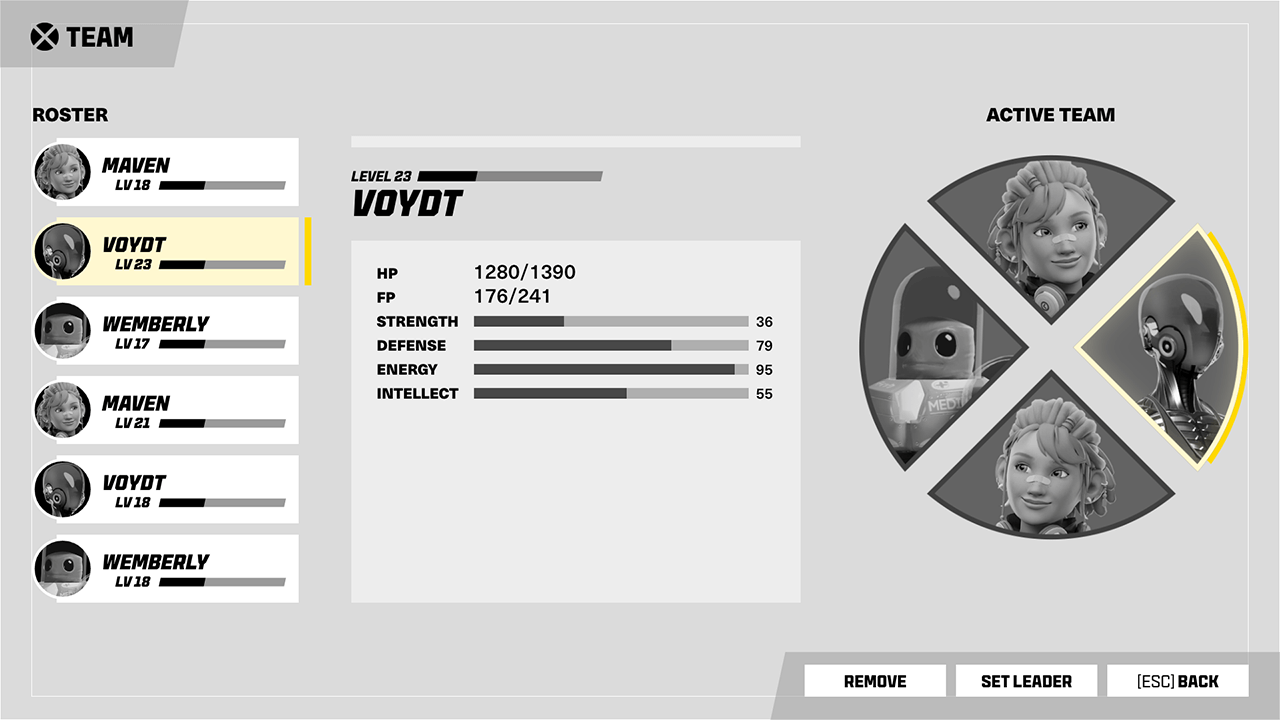
UX ITERATION: Team
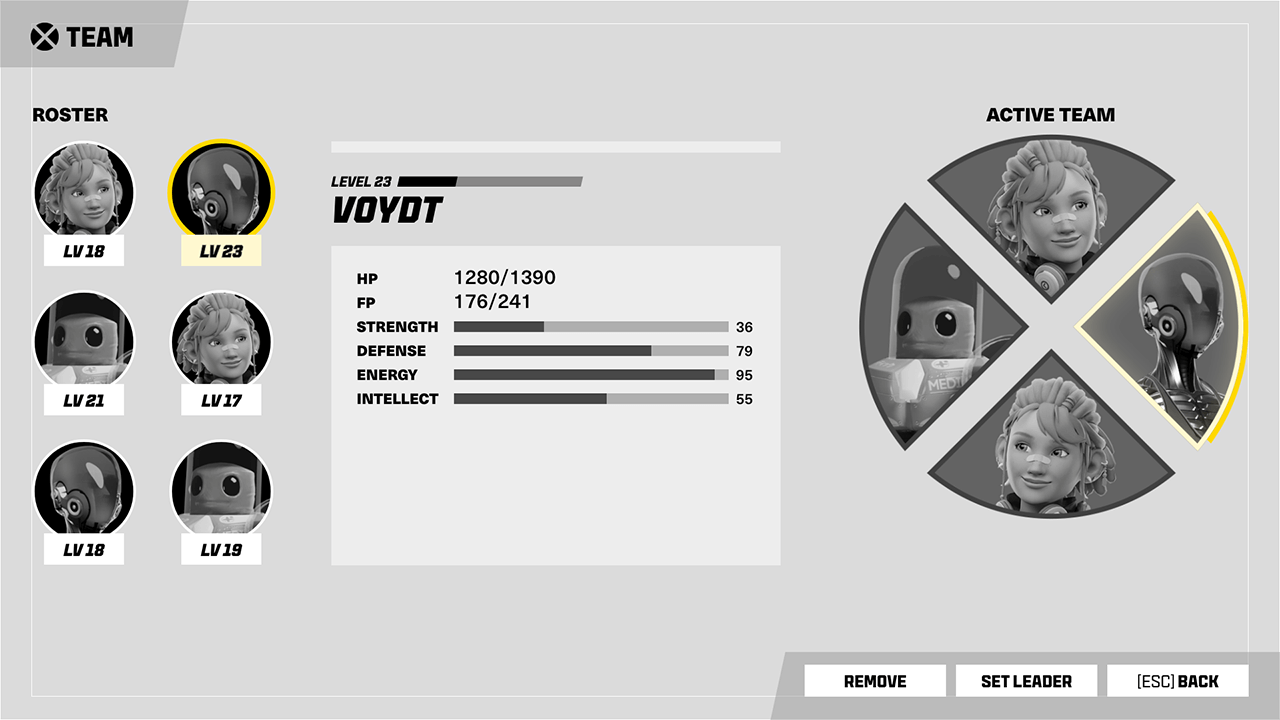
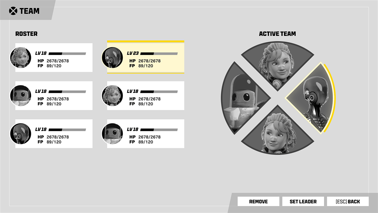
These layouts look at ways to organize the UI where players select their team members from a roster. The radial wheel on the right also appears in the HUD during gameplay, with each character's equipped special skill tied to a d-pad button.
UX ITERATION: Hub and Spoke Flow
Below is an early top-level view of the main menu system in Adobe XD (before I moved to Figma). In this prototype, I can navigate in and out of a few screens with a keyboard and mouse.
ICONS
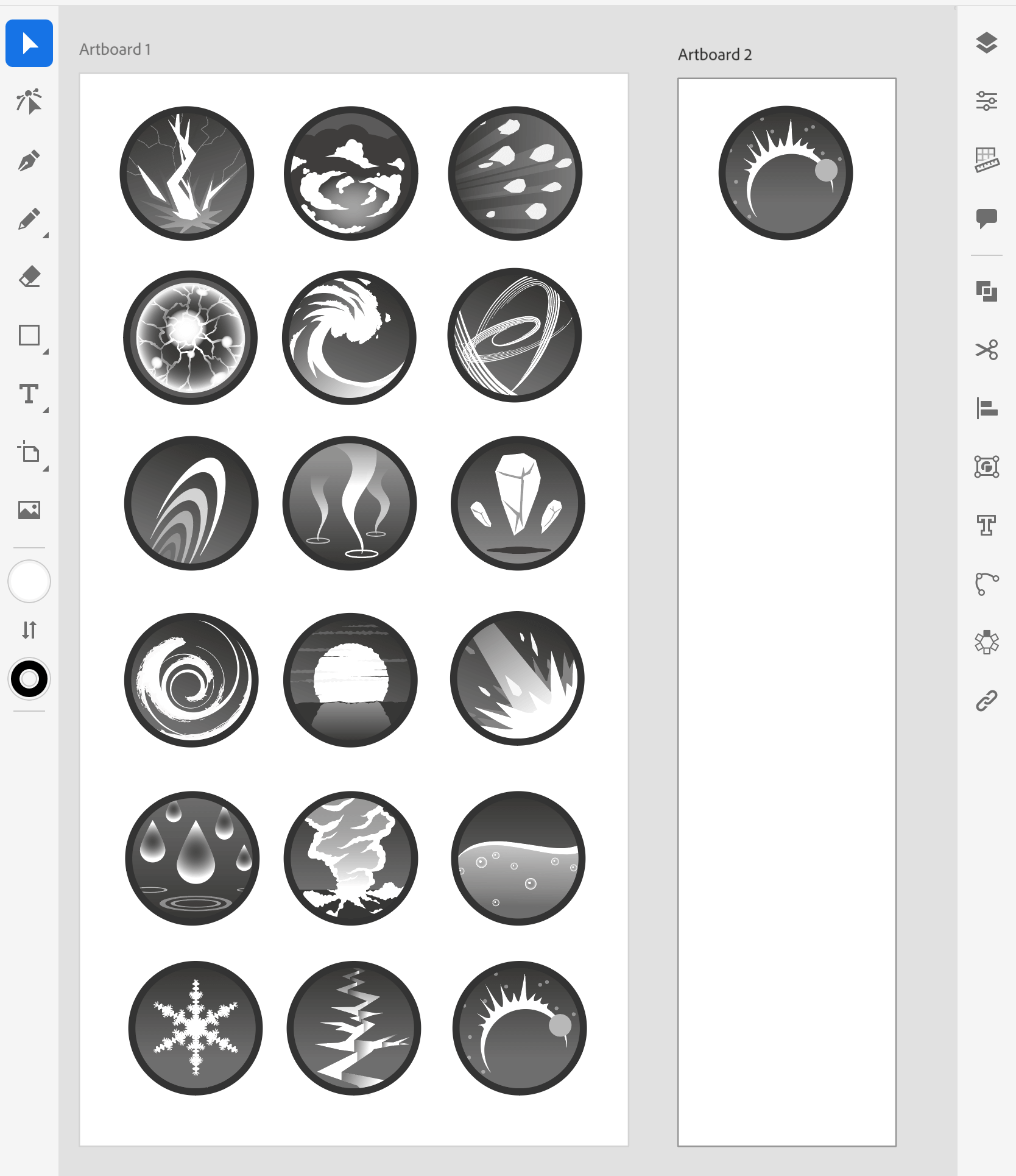
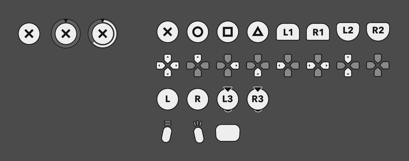
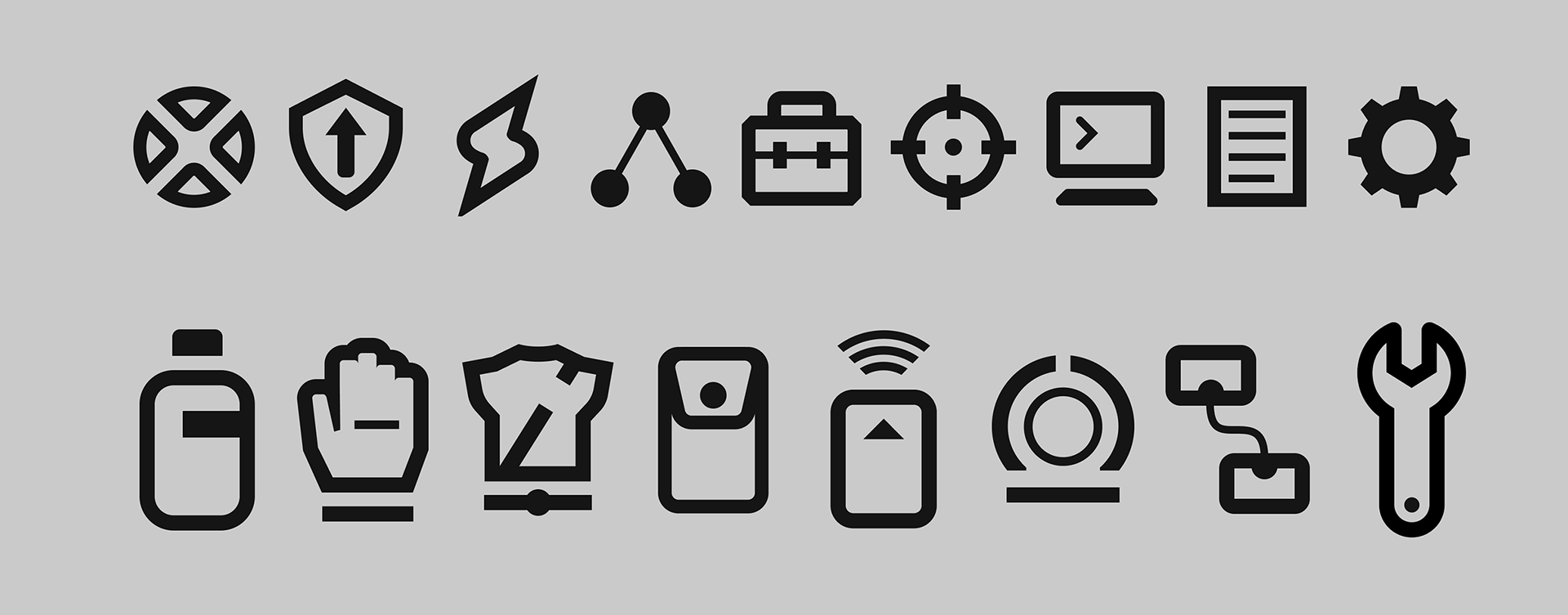
I made clean, informational vector icons for character abilities, menu categories, and PlayStation button prompts.
COLOR AND VALUE TESTS
After rendering a character I bought online, I started thinking about visual design style. These tests examine color, value, and treatment in the equipment screen that I grayboxed earlier.
BUTTON STATES
I like to make button focus states that change in three ways when highlighted:
1) a change in color/value
2) a change in size/footprint
3) a transition animation
DESIGN LIBRARY
My Figma library includes color swatches, text styles, effect styles, and component variables (with nested instances). The act of defining all of these elements makes the style more cohesive, both in terms of user experience and world building.
FINAL UI/UX DESIGNS
And here are all the HUD and menu comps I designed for this project together in one snapshot.


